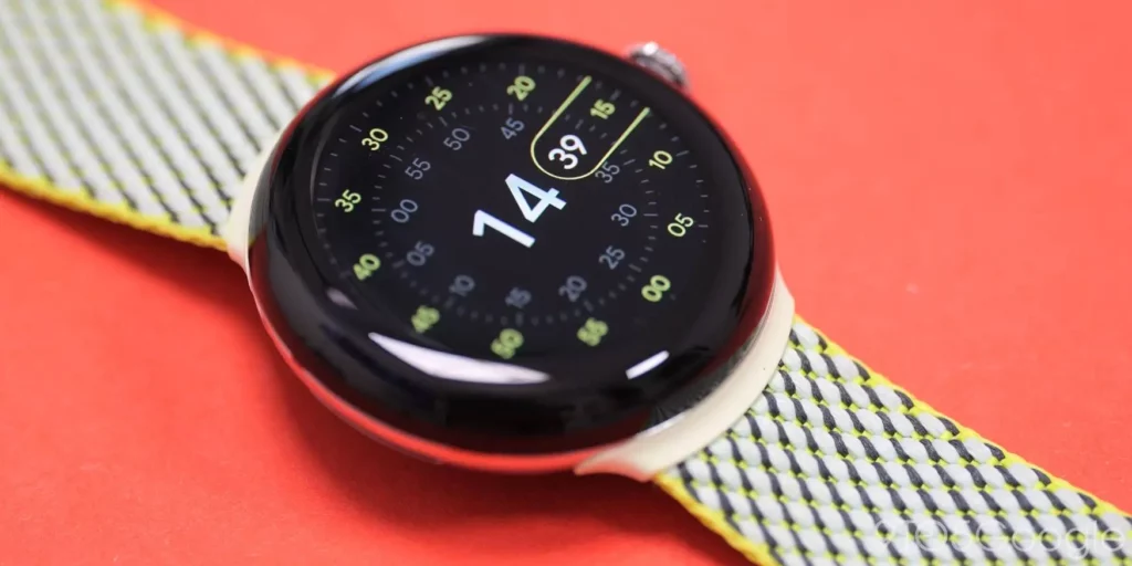
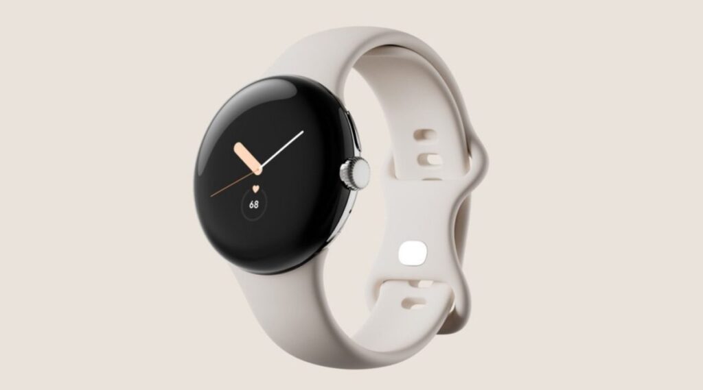
The Pixel Watch 3 brings several improvements compared to the previous version. It is available in two sizes and offers higher brightness, which makes it easier to see the display outdoors. Google has now released a new video showing the design of the Pixel Watch 3, focusing on an unreleased watch face called “Concentric”. This new design stands out for its simple and clean look.
Pixel Watch 3 design video
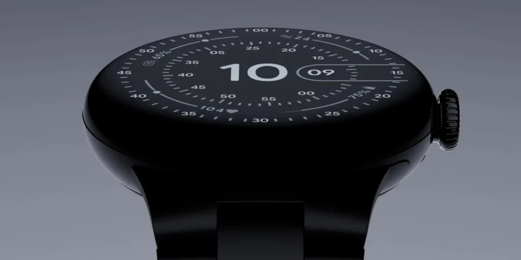
The Concentric watch face arranges elements in a neat circular layout, making it easy to read. It improves the overall appearance by placing four important features, called complications, in a ring between the minute and second markers. These complications are designed to provide key information without making the watch face look too busy. The new design focuses on being clutter-free, which not only looks good but also helps users access information more easily.
In the video, two of the complications display the heart rate and battery percentage. Another slot seems to show the breathing rate, but there is no sign of features like VO2 Max or cardio fitness score. The Concentric watch face may not be available yet, but this video hints that it could be included in a future update.
Google has always focused on combining good design with useful features in its smartwatches, and this new layout seems to continue that trend. Even though this new watch face is not yet released, it offers a glimpse into the future of what Google may bring to the Pixel Watch 3.


For even more news on the latest tech, click right here.