The speakers that currently grace my desk setup are one of the most pleasant surprises of the New Year so far (ignoring the fact that the standard is currently particularly low).
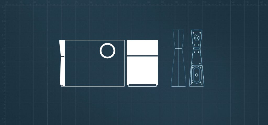
The quirky M3200 2.1 set eschews the traditional satellite speaker design in favour of a more elegant hourglass shape which bring a touch of class to any desk. Even mine, which is so lavished with overbearing RGB lighting that it could fry an egg. But as multiple seasons of Celebrity Big Brother have taught us, good looks don’t mean a damn thing – do Edifier‘s sexy little hourglass figures back up their slim waistlines with quality insides?
AUDIO: 4/5
The answer is yes – the subwoofer adds a lovely lower end to the satellites which deliver loud, clear audio. These are intended to be multimedia speakers and that definitely shows – performance is very much the same across movies, music and gaming. This can result in the middle getting somewhat lost, and the overall audio isn’t incredibly sharp – but casual listeners will be more than satisfied with the quality.
The bass can be controlled separately via a dial on the back of the subwoofer and while it’s not going to burst any eardrums it’s perfectly adequate. Adequate enough to get my neighbour yelling through the floor at me (I’ve had to listen to their domestics for the past six months so they can put up with a little bit of bass for a couple of days). Cranked up all the way the M3200 is loud as hell – but the clarity definitely starts to suffer on the higher end of that spectrum.
STYLE AND BUILD QUALITY: 4.5/5
The unique satellites are obviously intended to be a massive selling point for this particular 2.1 setup and whether or not they look good is very much subjective. Whether they’re to your taste or not, they’re quite understated and low profile, sitting comfortably on the tiniest surfaces. A lot of time has been spent on slimming the drivers down to this compact form, and it’s honestly a little surprising when you hear how big the sound is compared to the physical size. Personally, I think they look great:
My one major complaint is that much like any glossy plastic surface they scratch at the slightest pressure, the sleek speakers quickly losing their sheen. They would look so much better with matte black coating. The volume control is really stylish too – an LED halo illuminating a satisfyingly heavy dial.
The subwoofer is a massive, squat contrast, but much narrower than most bass units, meaning it can still be tucked away discreetly underfoot without being too much of an obstacle. Aside from the cheap-looking gloss they have a premium-feeling exterior and definitely outshine some similar blocky options in their price range.
VALUE FOR MONEY: 4/5
Polarising looks aside, the M3200 is a great set for the £69.99 price tag. It outperforms a lot of competitors and proves that speaker design doesn’t have to stick to the same old thing time and time again – and that big design doesn’t have to come with an equally rotund price tag.
I’d say the set currently sits at an ideal price point, but that probably comes down to how keen you are on the design – if the hourglass satellites don’t appeal you’re probably more likely to opt for a cheaper set with a more traditional aesthetic but at least consider that the M3200 has significantly better audio output than a lot of slightly more expensive block speakers.
Edifier’s M3200 comes with a hearty recommendation whether you’re looking for a decent 2.1 set or just something a little bit different. The flaws are so minor compared to the overall quality, a slight lack of clarity and cheap shiny plastic is more than made up for by the solid drivers and low-profile design. A purchase you can be confident in, and a great portfolio piece for Edifier. Here’s hoping we see more audio excellence from them on our troubled shores in the future.
Edifier M3200 Overall Score
4/5
For more speaker reviews as well as reviews of other tech, click HERE.

